By : Pragya Mishra
It is often believed that data science is made up of advanced statistical and machine learning techniques.
But another key element of any data science enterprise is often underestimated and overlooked: Exploratory Data Analysis (EDA). Exploring the dataset using immensely in-depth and intuitive exploration techniques aids the choice of the path to follow for the project and select the suitable algorithms. This step aims to understand the dataset, identify the missing values & outliers if any using visual and quantitative methods to get a sense of the story it tells. It proposes logical next steps, questions or areas of research for your project. It is a crucial step in data mining. used for seeing what the data can tell us before the modeling task. It is not easy to look at a column of numbers or a whole spreadsheet and determine important characteristics of the data. It may be tedious, boring, and/or overwhelming to derive insights by looking at plain numbers. Exploratory data analysis techniques have been devised as an aid in this situation.
Steps in Data Exploration and Preprocessing:
- Identification of variables and data types
- Analyzing the basic metrics
- Non-Graphical Univariate Analysis
- Graphical Univariate Analysis(histograms and countplot)
- Bivariate Analysis
- Variable transformations
- Missing value treatment(using pandas functions)
- Outlier treatment(using boxplot)
- Correlation Analysis(through tools such as heatmap)
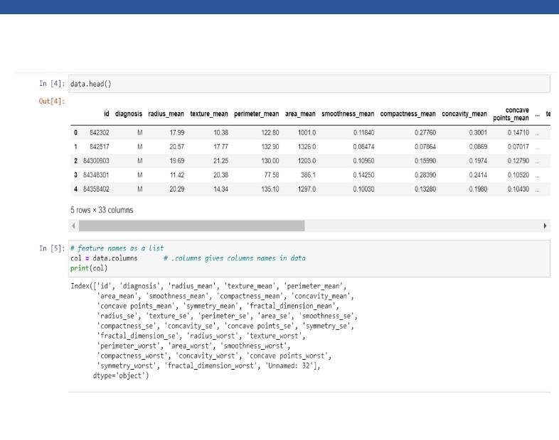
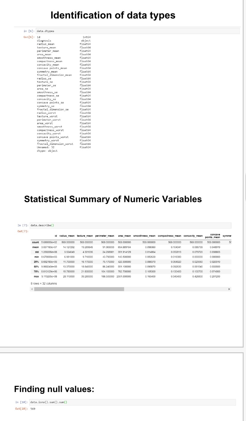
Identification of variables and data types
The very first step in analyzing exploratory data involves determining the type of variables in the dataset.

Categorical data – is a type of data that can be stored into groups or categories with the aid of names or labels. This grouping is usually made according to the data characteristics and similarities of these characteristics through a method known as matching.
Nominal data – This is the data type of categorical data that names or labels. Sometimes called naming data, it has characteristics similar to that of a noun.
Ordinal data – This type of categorical data includes elements that are ranked, ordered or have a rating scale attached. One can count and order, nominal data, but it can not be measured.
Numerical data – is a type of data that is expressed in terms of numbers rather than natural language descriptions. Similar to its name, numerical, it can only be collected in number form.
8Discrete Data – Discrete data is a type of numerical data with countable elements. I.e they have a one to one mapping with natural numbers. A discrete data can either be countably finite or countably infinite.
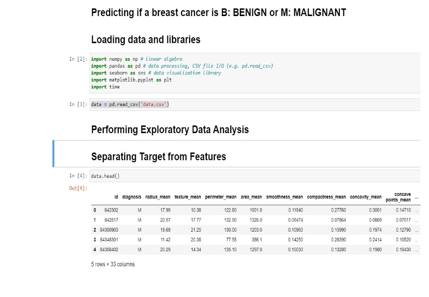
Continuous Data – Continuous is a numerical data type with uncountable elements. They are represented as a set of intervals on a real number line . Similar to discrete data, continuous data can also be either finite or infinite. Here are some simple snippets from my project on the Kaggle Breast Cancer Dataset.
Dataset
Graphical Analysis
Countplot
A countplot is kind of histogram or a bar graph for some categorical area. It simply shows the number of occurrences of an item based on a certain type of category. Here we have a countplot of the number patients with positive and negative diagnosis of breast cancer using seaborn in python.
Violinplot
A violin plot is a method of plotting numeric data. It is similar to a box plot, with the addition of a rotated kernel density plot on each side. Violin plots are similar to box plots, except that they also show the probability density of the data at different values, usually smoothed by a kernel density estimator.
Jointplot
Seaborn’s jointplot displays a relationship between 2 variables (bivariate) as well as 1D profiles (univariate) in the margins. This plot is a convenience class that wraps JointGrid. The multivariate normal distribution is a nice tool to demonstrate this type of plot as it is sampling from a multidimensional Gaussian and there is natural clustering.
Heatmap
Heatmap is defined as a graphical representation of data using colors to visualize the value of the matrix. In this, to represent more common values or higher activities brighter colors basically reddish colors are used and to represent less common or activity values, darker colors are preferred. Heatmap is also defined by the name of the shading matrix. Heatmaps in Seaborn can be plotted by using the seaborn.heatmap() function.
